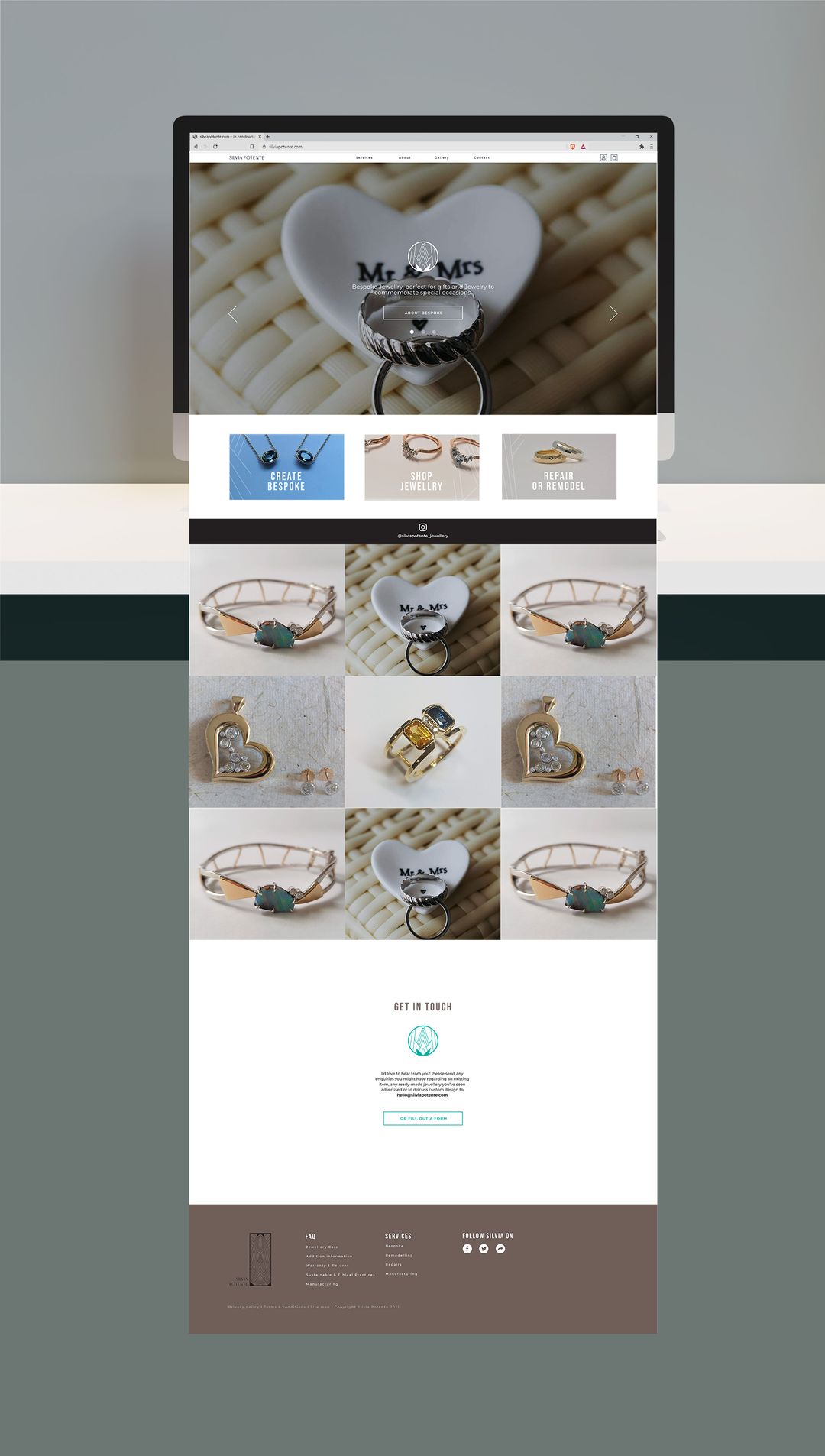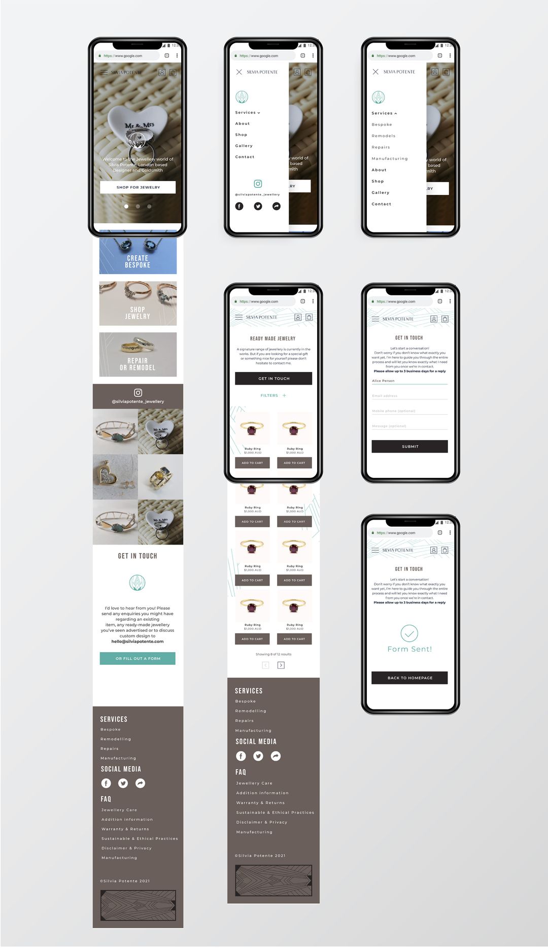


An online body of work to show prospective clients bespoke jewellery. 💍
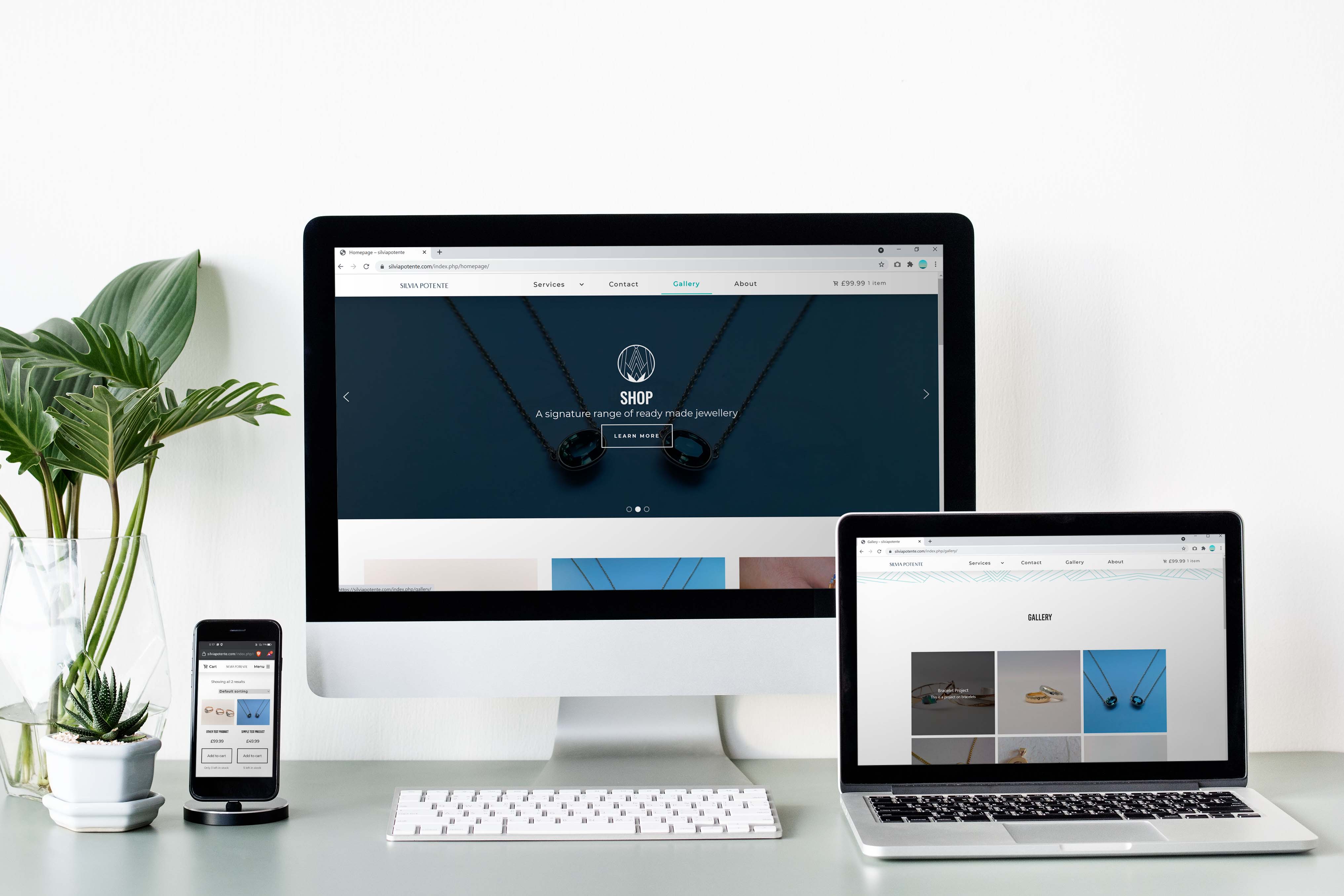
Silvia is a Bespoke Jeweller based in the UK who required an improved website that connected with more clients and which showcased her work.
Her brief was to make it clean, simple, easy to navigate and include a blog. This required an evolution of her existing branding to be used across all media.
Through a series of drafts it was agreed that a minimalist approach without a blog would serve Silvia's needs more effectively. All drafts shown below.

In keeping with the original idea, the first design for the website was clean, and minimal - informed by the rectangular version of the logo, and included a blog.
The second design drew instead from the circular version of the logo and opted for a more illustrative and playful approach.
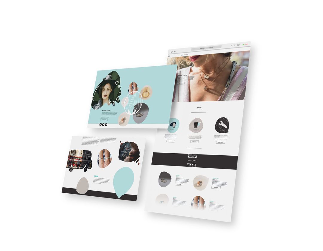
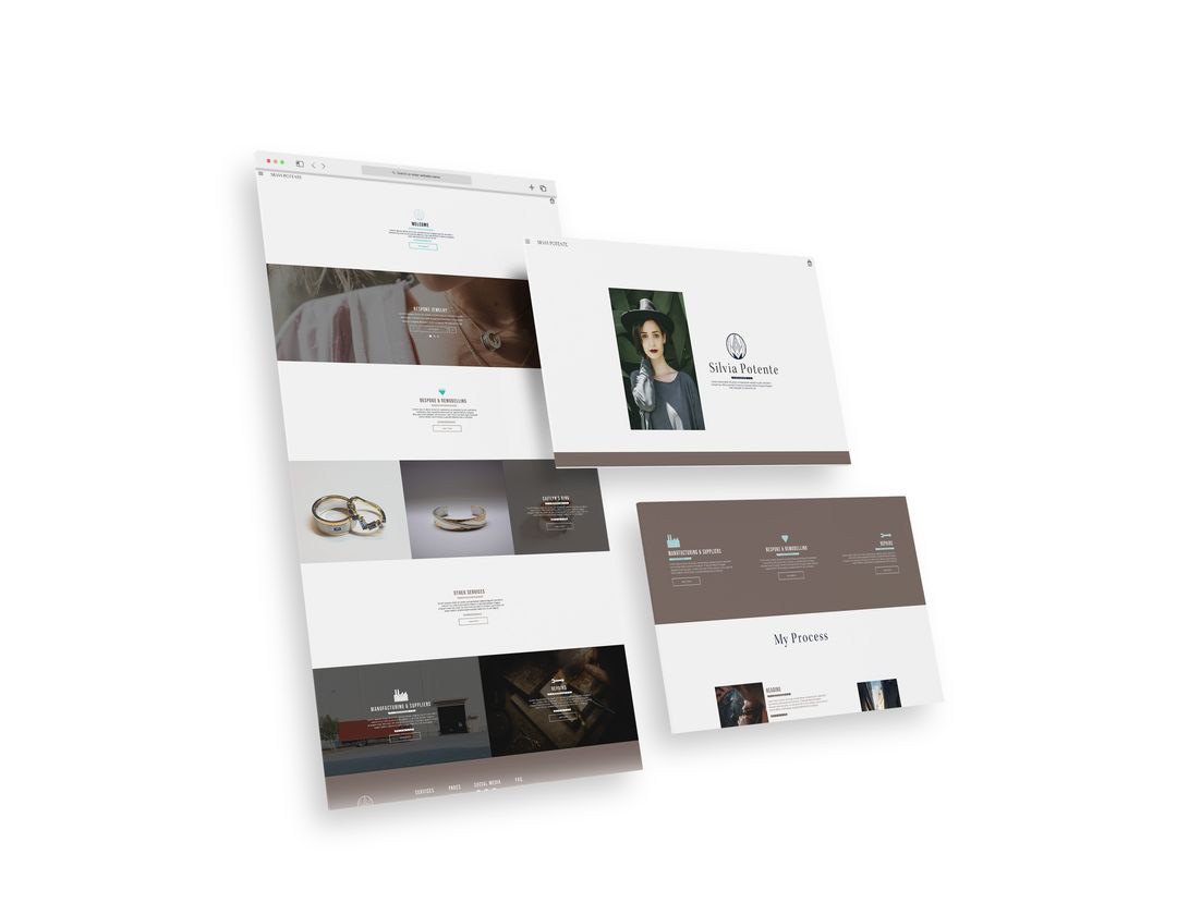
The third design was aimed at being more versatile than the other designs and incorporated illustrations and dividers using the pattern on both of Silvia's logos, allowing her to use either version.
Throughout the design process we discovered that a lightweight, more minimal design would suit Silvia's needs more effectively. So the final design is less informed by branding and not as feature or content rich as the original design - but much easier to host and maintain.
