


Creating a secure, scalping-free ticket ecosystem and marketplace. 🎫🔒
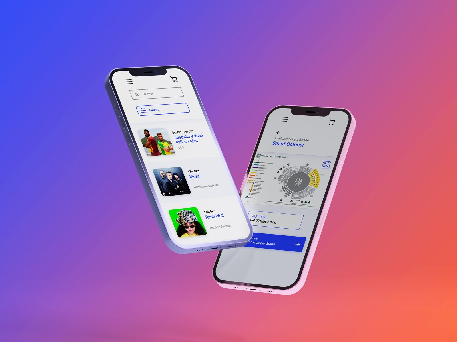
Veritik utilised new technology to combat scalping and create a secure ecosystem for online ticket purchase or reselling, incentivising in-app transactions and offering resellers a legitimate platform.
My task was to create a increase the fidelity of an existing wireframes and suggest usability improvements where possible. These were to be used to pitch the idea to potential investors in the preliminary stages of the project.
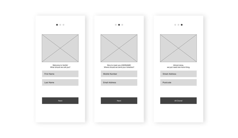
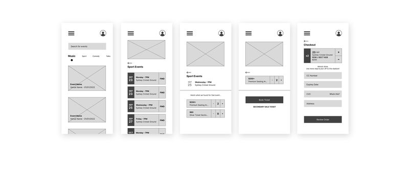
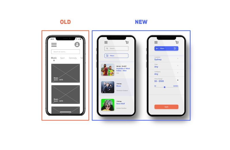
The early wireframes had a search bar and categories to find events, with events shown in chronological order. My suggestions for improvements included:
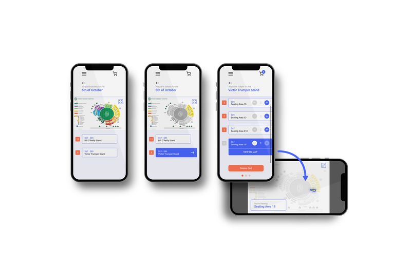
The wireframes featured an interactive and dynamically updating seating plan, but weren't developed past one state. I added zoom and expansion functionality due to screens having limited space, and also the ability to choose a seating area without having to click on the map to account for different device functionality and/or venues not supplying a working interactive map.

Owned tickets could be accessed via the app and scanned at events. I suggested adding states for each part of the scanning process such as:
